Substack Solution? My Thoughts on Fixing Substack Thumbnails
Tired of Substack cropping parts of your thumbnails? I found a pretty good solution! Get the dimensions and tips here to make your thumbnails look great across web, mobile and other layouts!
The Journey to Fix My Substack Thumbnails
Ever feel like you're fighting with your Substack thumbnails/social previews? If you're anything like me, you pour a lot of time into your creativity, only to have your thumbnails not turn out exactly as you’d like them to!
As someone that is still new-ish to Substack and who cares about getting things done as good as I can, I have tried to make my publication’s pages look nice, including my thumbnails.
However, one of the issues I have repeatedly run into for my main gaming publication, The Saved Game, has to do with the social previews/thumbnails. I love having some title text in my thumbnail, as well as borders around the sides! To my dismay, I was having a lot of issues getting this to work initially, where various views would crop out elements I wanted in my thumbnails!
Often for me, the text, borders, and content would get cropped out on the mobile view. Or the top and bottoms parts would get cut out if it was featured on my Substack page. Or if someone restacked one of my posts, a chunk of the top or bottom would get cropped out with an overlay on top of it…
Ugh…
The primary issue I found has to do with Substack’s own dimension recommendations being a bit off that I initially used. This is taken from the Substack Support page on the recommended sizes that I tried following previously:
“Social / post preview image: We recommend at least 1456 x 1048 px, but 420 x 300 px is the minimum. 14:10 is the aspect ratio for the preview images.”
However, when I tried these dimensions, such as the recommended 1456 x 1048 pixels, it would crop out some of the sides of my thumbnails, as well as the other issues I mentioned. This wasn’t great, because I like to have borders on most of my thumbnails.
So, I spent some time to get the measurements as close as I can through trial-and-error, while also accounting for the different views that people may see your thumbnail at on mobile or if your post is restacked. This might not work for everyone, but I hope it helps you as much as it helped me! I've just been wrestling with the thumbnails for my publications and wanted to share my findings. I’d be super happy if it does help someone else though!
Let’s jump into it!
Welcome
First off though, I want to extend my warmest welcome and send my thanks to you for the privilege and honor of your time! My name is Joe — I am a creative, avid photographer, fascinated techie, lifelong gamer, eager writer, nostalgia enthusiast, coffee lover, and taco fanatic 🌮
My main publication is called The Saved Game! In that gaming-focused publication, I send out articles about my thoughts and experiences from video games, and jump into the meaning behind them and the impact they make in our lives! If you love games, or are interested in learning more about them, then definitely check it out (as I no longer post on this Hey, I’m Joe publication)!
Lastly, if this article was helpful, then consider taking a look at my Ko-fi page using the button below if you would like to support my work! Thanks!
Kicking Things Off
Thanks for sticking with me! To kick things off, let's talk about header styles on Substack and what works best for the dimensions I use for my thumbnails. From what I've found, the thumbnail designs that I’m going to show you work best when your publication's header style (located under Branding > Homepage) is set to one of these options:
· Featured
· Newspaper
· Magazine
· Media Feature
Just as a heads-up: if you're using the “Highlight” style or when viewing posts in the Archive tab, it tends to crop just a bit more aggressively around the edges using my thumbnail dimensions — just something to keep in mind if you’re being strict about borders!
Before we go any further, a quick note on terminology: I know these images go by many names from what I’ve seen — Social Previews, Post Previews, Thumbnails, and more. For simplicity's sake, I'll be referring to them only as “thumbnails” throughout the rest of this article.
Step One: Turn Off Smart Cropping
First things first, let's turn off Substack's automatic cropping if you have it on! For this article — and for my preferred method — I recommend turning off the default smart cropping feature in your settings.
You'll find this option under Settings > Branding > Post Thumbnail Cropping Method.
Make sure you set this to Centered!
Step Two: Build Your Awesome Thumbnail Canvas
Now that we've handled Substack's settings, let's set up your creative workspace!
While I'll be using Photoshop for this example, feel free to use your favorite photo or image editor! I know Canva is popular nowadays, and this can be done there as well. I will be using rulers/guides in this article — if you need a little help with this, you can check out this video to learn more for Canva rulers/guidelines! Check out this video for the way to do this in Photoshop!
Set the Dimensions:
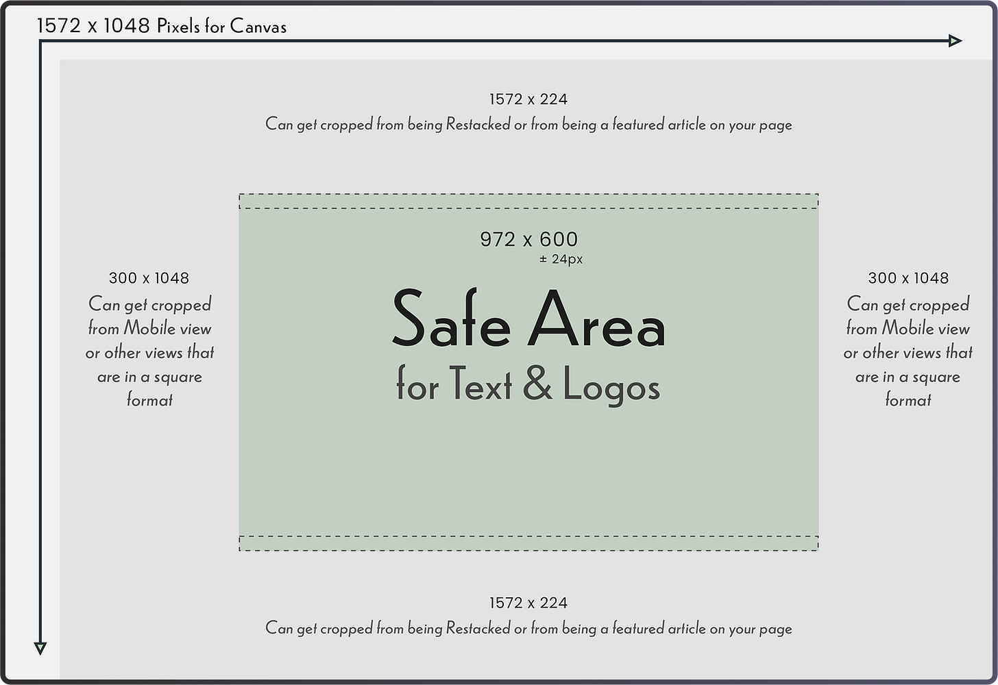
I set the dimensions of my canvas for 1572 x 1048 pixels. As far as I can tell, this will not crop out anything on the edges for regular posts.
Once your canvas is ready, you'll want to create some guides to define your “safe” zone using the ruler. I've put together a visual illustration for you below.
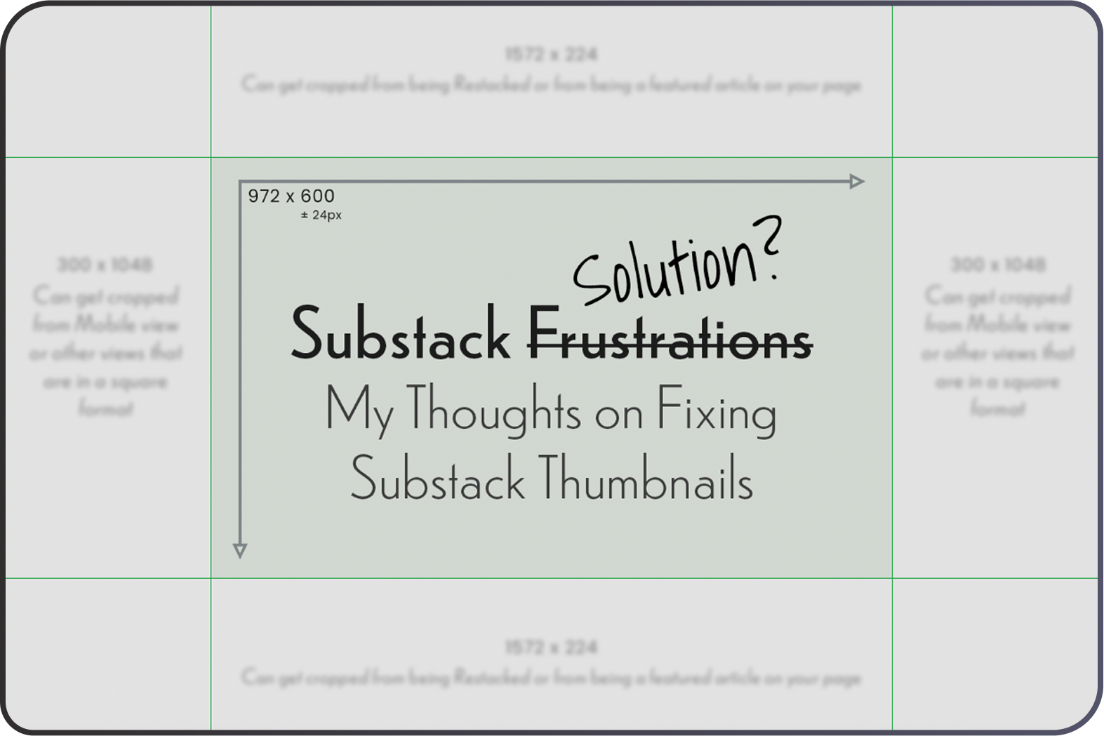
This first illustration shows the overall width and height of the canvas, the safe area for text/content in the green/centered zone, as well as the areas to avoid that are greyed out.
The dotted area on the top and bottom of the green/centered zone is 24 pixels (plus or minus a bit) of padding that I would advise to keep any text/content out of.
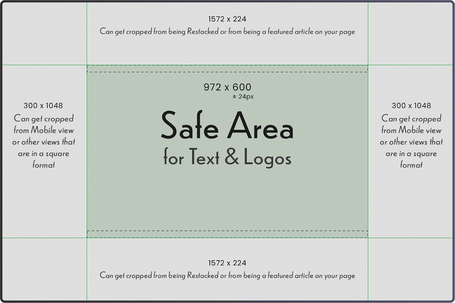
This second illustration shows the green guidelines in place, sectioning off the various areas that may experience cropping. Keep reading below to see exactly where to place your guides!
Your main text and critical content should stay within the green/centered area, as seen in the above illustrations. This ensures it won't get cut off at all, as far as I can tell from my testing. Anything outside this green zone, in the greyed-out areas, might get cropped depending on where your thumbnail appears — whether it's featured on your homepage, restacked in Notes, or being viewed on mobile (which kind of squares it all off).
Of course, you can absolutely fill the entire canvas with content, just be mindful of that critical green/centered zone for anything essential that you must have or want to be displayed!
As far as I can tell, when a post is restacked, it is randomly cropped at the top or bottom. I have seen it either way, or both ways on some of my write-ups! This is why I typically keep both the top and bottom sections clear of anything that I want to make sure is displayed.
Set the Guidelines on Your Canvas:
To set up your own guidelines, ensure your ruler tool is showing/available in your editor. Then, simply drag out the rulers to mark your safe zones precisely. This keeps everything tidy and helps you visualize where your content sits. Refer to those videos I linked earlier to help with the ruler tool.
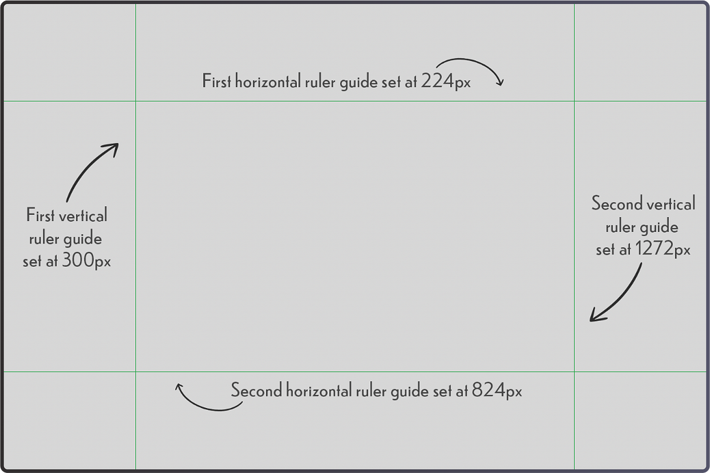
Here’s a quick breakdown of where to place the guidelines for the 1572 x 1048 canvas:
· Drag the first horizontal ruler/guide down to 224 pixels.
· Drag the second horizontal ruler/guide all the way down to 824 pixels.
· Drag the first vertical ruler/guide over to 300 pixels.
· Drag the second vertical ruler/guide all the way over to 1272 pixels.
These rulers are also super handy for perfectly centering your content, which is what I do all the time! To do this, just drag some more guides to center it on your canvas. Photoshop and Canva will normally snap it to the center by default!
Step Three: Design Your Thumbnail
With your canvas and guides perfectly set up, you're ready for the fun part: adding your content and graphics! Just remember to keep anything you want fully displayed within that centered area on your canvas!
I would recommend not adding a corner radius, and to keep the edges sharp.
I usually add an inside border as well at about 8 pixels, but you do not need to do this if you do not want to.
Once your design is complete and looks just right, go ahead and export your image, then upload it as your post's thumbnail! Test around and make sure it looks good!
While it's not essential, I've found it incredibly helpful to save these ruler/guide settings as a reusable template in Photoshop. I think you can also do the same in Canva with a pro account. It's a real time-saver for quick access whenever I need to create a new thumbnail!
Showcasing an Example of Mine:
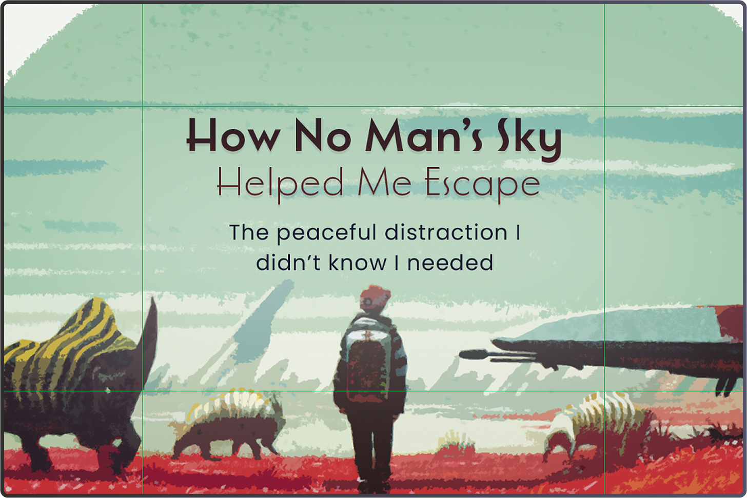
Here is an example of a finished thumbnail from my other publication, The Saved Game, for an article I wrote awhile back on No Man’s Sky, where I have the guidelines in place.
Once it is on my Substack webpage, these thumbnails will have the borders fully surrounding it, and the content where I want it!
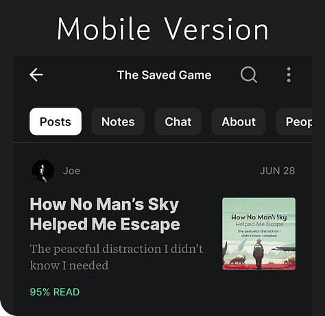
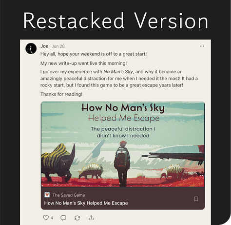
Here are some examples of how the No Man’s Sky thumbnail looks on the mobile version, web version of my Substack page, and when it has been restacked. For the mobile version, the thumbnail is squared off, but the centered contents are still fully visible. For the web version, the thumbnail with borders is fully visible. The restacked version is cropped, but displays the contents.
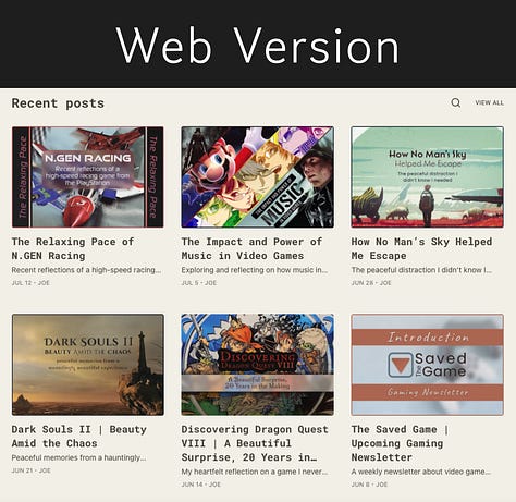
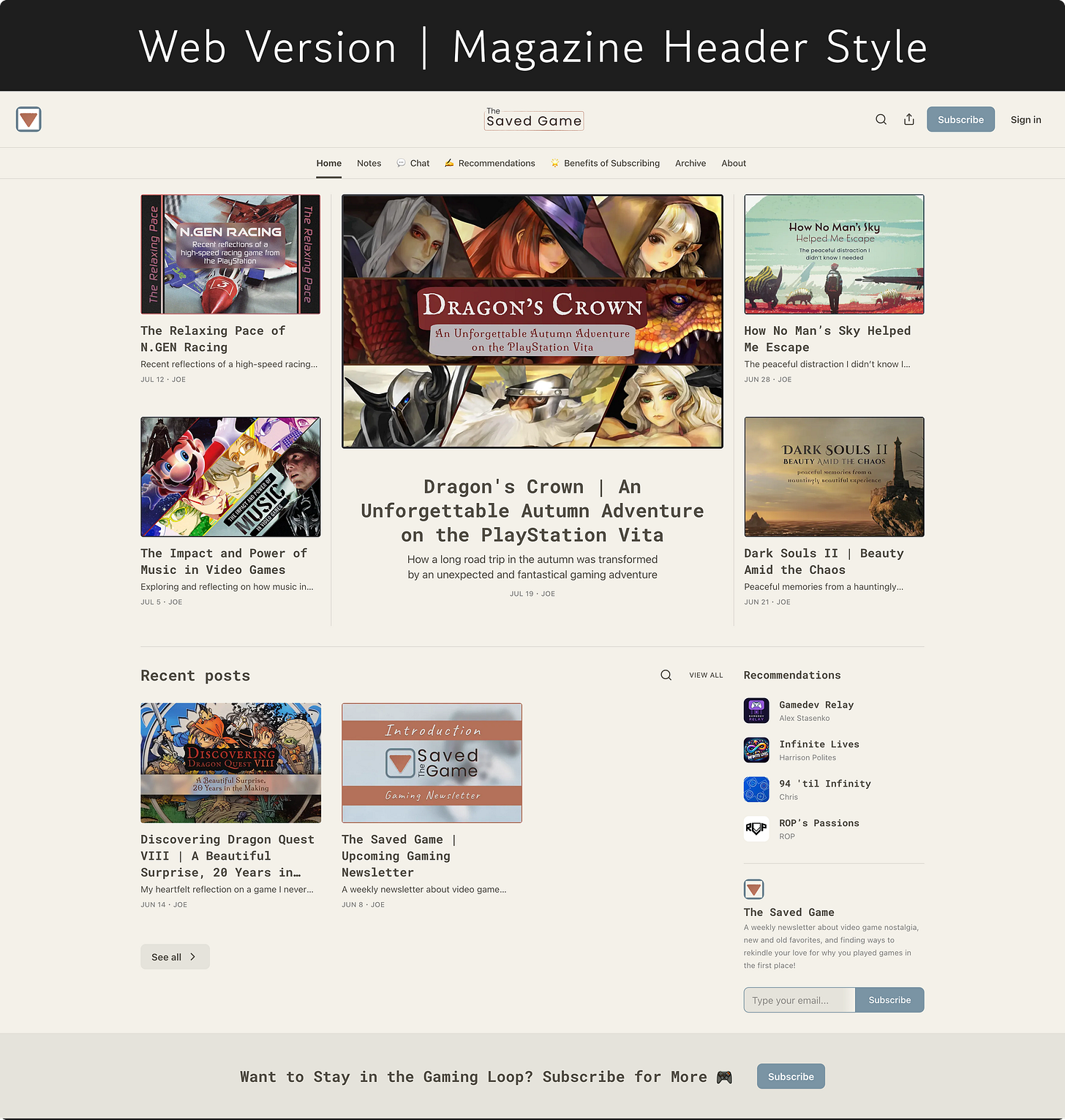
This last example is a full-page screenshot, showing how the thumbnails look in the Magazine Header Style for my Substack page of The Saved Game.
Wrapping Things Up
I hope that this might have worked for you!
Thank you for the honor and privilege of your time! It means a lot that you’re here, and I appreciate your readership!
See you all next time,
Joe
Support and Connecting
Would you like to keep seeing my content and creative work?
I put time and effort into the writing, designs, and creation of these write-ups, and I would love to keep doing them! If you would like to support my work, then view my Ko-fi page using the button below! Thanks!
Follow me on Instagram or Bluesky for post updates, nostalgic thoughts, and more!
📷 Instagram: https://www.instagram.com/thesavedgame/
🦋 Bluesky: https://bsky.app/profile/joeswritingworks.bsky.social
My main publication is called The Saved Game. In this gaming-focused publication, I send out newsletters about my thoughts and experiences from video games, and jump into the meaning behind them and the impact they make in our lives! If you love games, or are interested in learning more about them, then definitely check out it out!




This is gold! So valuable, and I love the diagrams you crafted to explain your points (especially the one where it shows the safe parts of the canvas). I will book mark as reference, thanks!
This is such a valuable post! Been a real struggle tackling the thumbnail dimensions. Thank you!